Customise the home page
Build the member-facing home page with linked section cards, responsive banners and clear layout controls.
customise platform home page.mov · Reviewed against the Buzzmint Engage interface on 16 July 2026.
What you can add to the home page
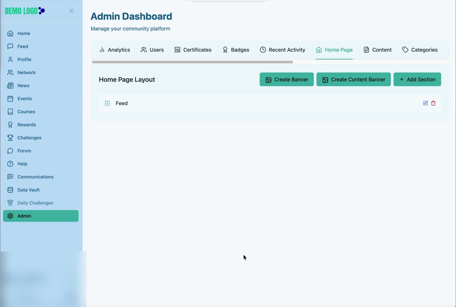
The Home Page Layout area lets an administrator shape the first screen members see after signing in. The walkthrough demonstrates three component types:
Guide members to a destination
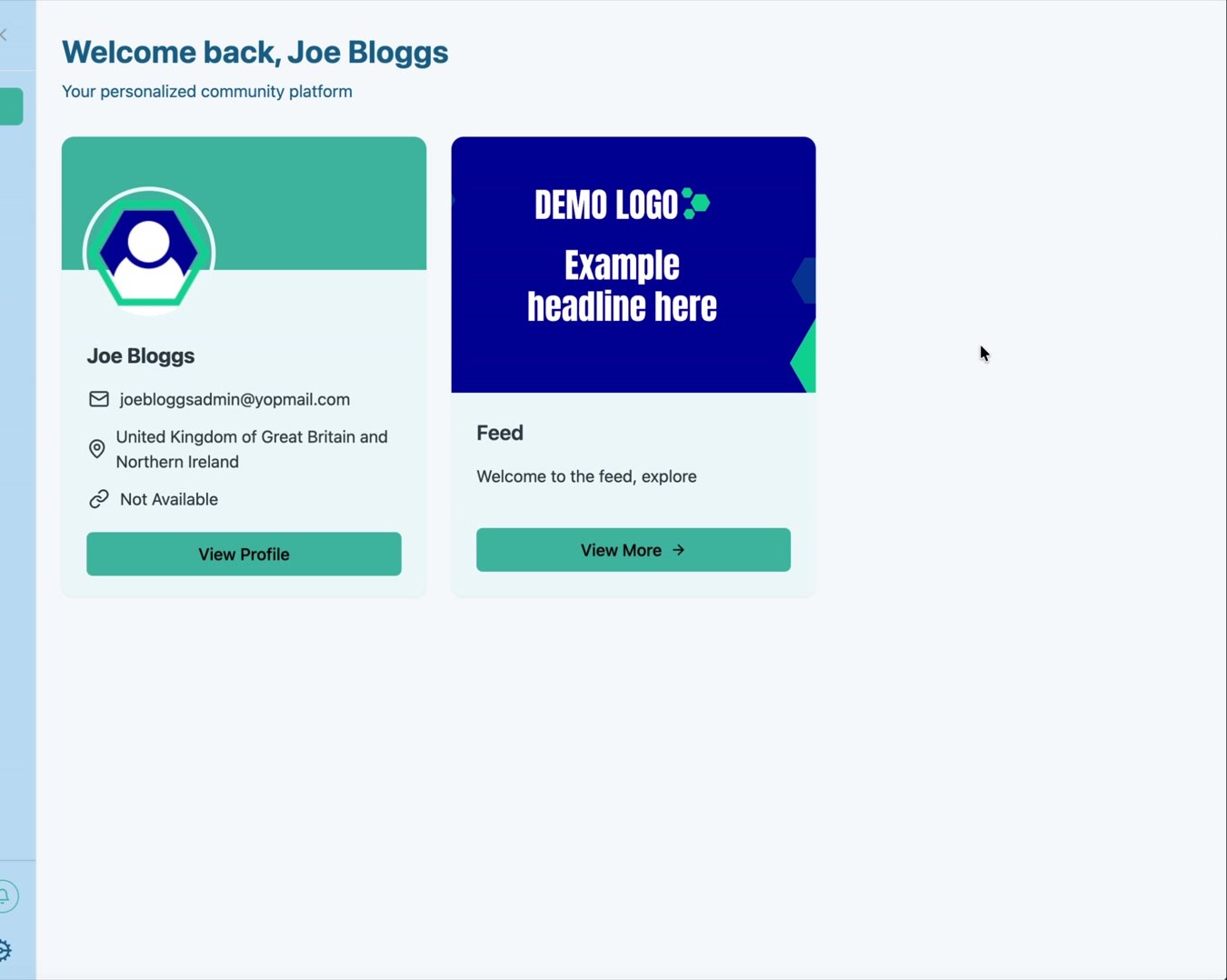
Combine a title, image, short description, link and button label in a reusable card.
Feature a priority message
Add a full-width desktop banner, an optional mobile version and an optional destination URL.
Add a visual content tile
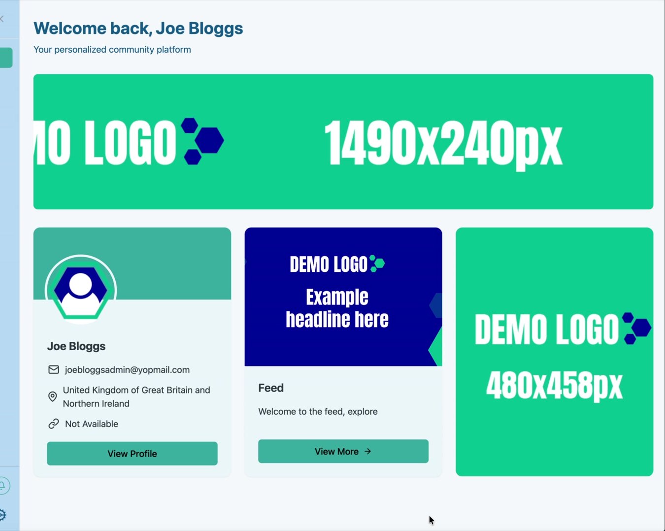
Use a 480 × 458 px image as an additional linked item in the home-page grid.
Reorder, edit or remove
Use the drag handle and action icons to maintain the home-page sequence.
Before you begin
- You have administrator access to the correct Buzzmint portal.
- The destination pages or module URLs have been confirmed.
- Section titles and descriptions have been approved.
- Desktop, mobile and content-banner artwork has been prepared at the recommended sizes.
- Each link has been tested in a separate browser tab.
| Asset | Recommended size shown in the platform | Notes |
|---|---|---|
| Full-width banner | 1490 × 240 px | Designed for optimal display across devices. |
| Mobile banner | 600 × 240 px | Optional; used below the small-screen breakpoint. |
| Content banner | 480 × 458 px | Used as a visual tile within the home-page content area. |
| Section image | No fixed dimensions shown in the walkthrough | Use consistent artwork with a safe central crop and legible text. |
Open Home Page Layout
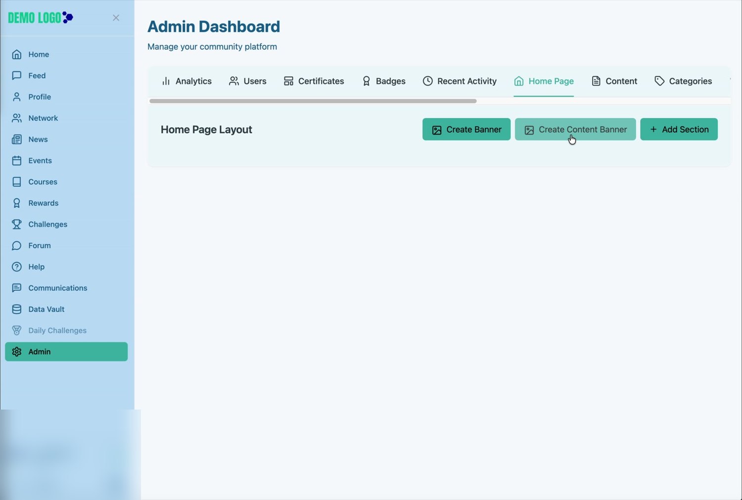
Open Admin
From the left-hand portal navigation, select Admin.
Select Home Page
In the Admin Dashboard tab bar, select Home Page.
Review the current layout
The Home Page Layout list shows the components already displayed to members and provides controls for creating new items.
Add a section card
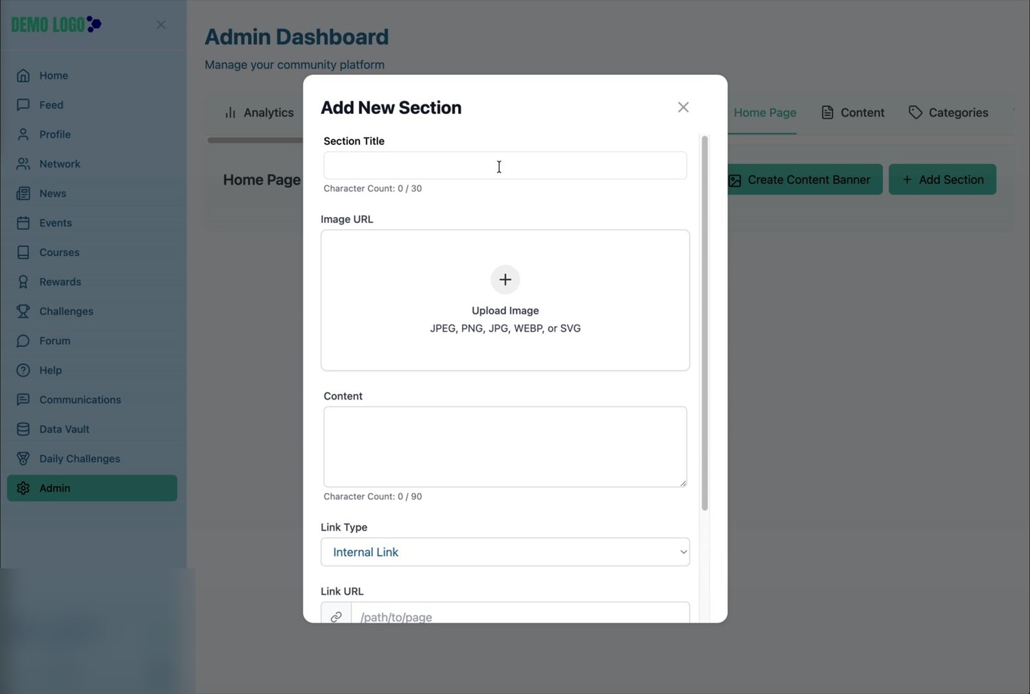
Select Add Section
Open the Add New Section form from the upper-right of Home Page Layout.
Add the section title
Enter a short label. The interface displays a maximum of 30 characters.
Upload the section image
The upload control accepts JPEG, PNG, JPG, WEBP and SVG files.
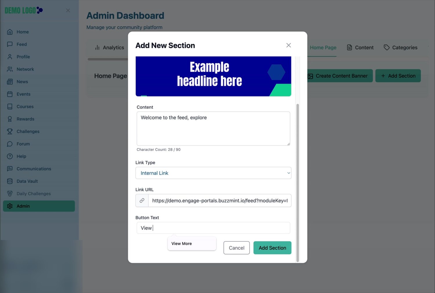
Write the supporting content
Add a concise description. The interface displays a maximum of 90 characters.
Configure the destination
Select the appropriate link type, enter the destination URL and add the button text members will see. The walkthrough uses an internal link to the Feed and the label “View More”.
Select Add Section
Save the item, then confirm it appears in Home Page Layout.
Reorder, edit or delete a section
After creation, the section appears as a row in Home Page Layout. Use the dotted drag handle to change its position, the pencil icon to edit it, or the bin icon to remove it.
Create the full-width banner
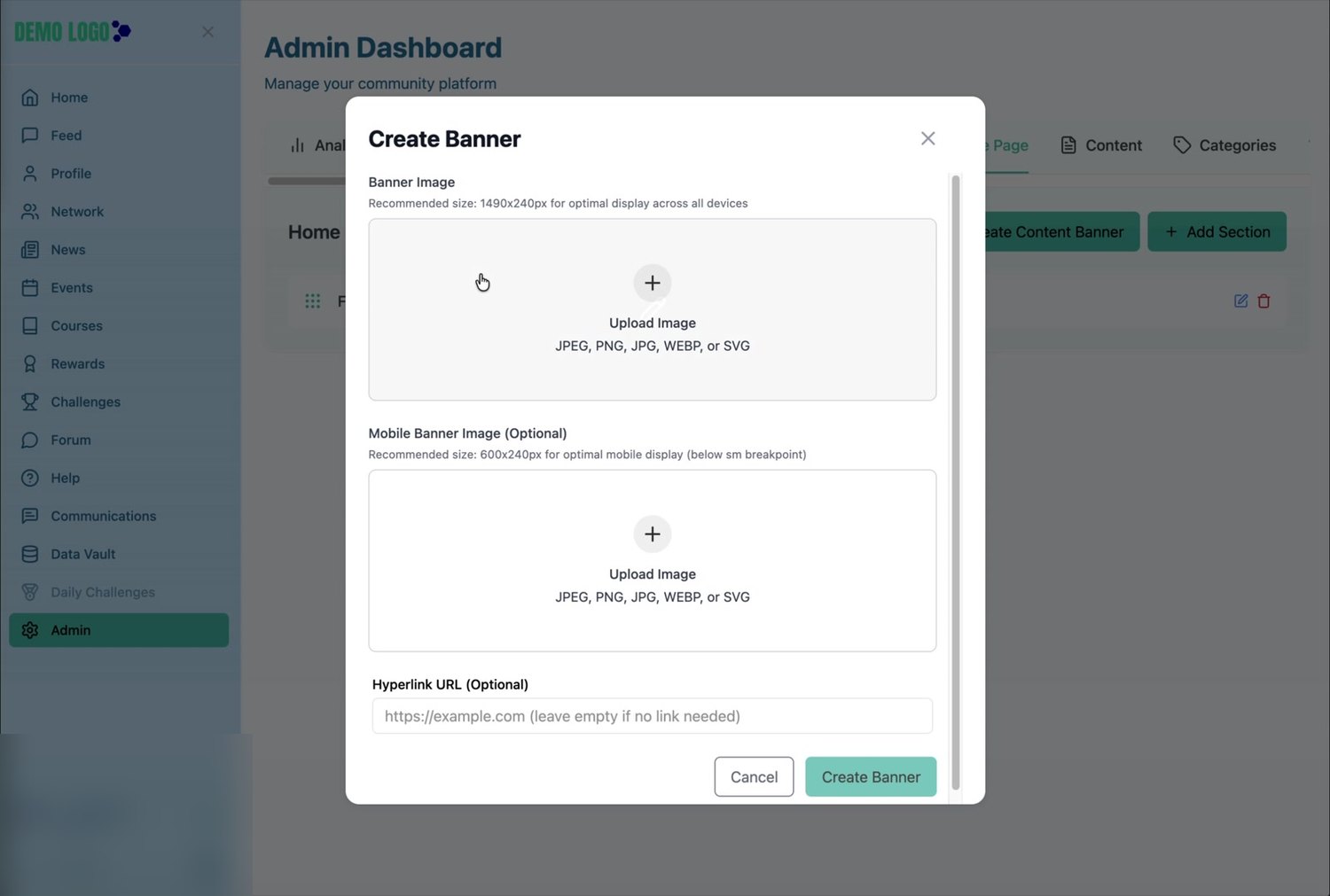
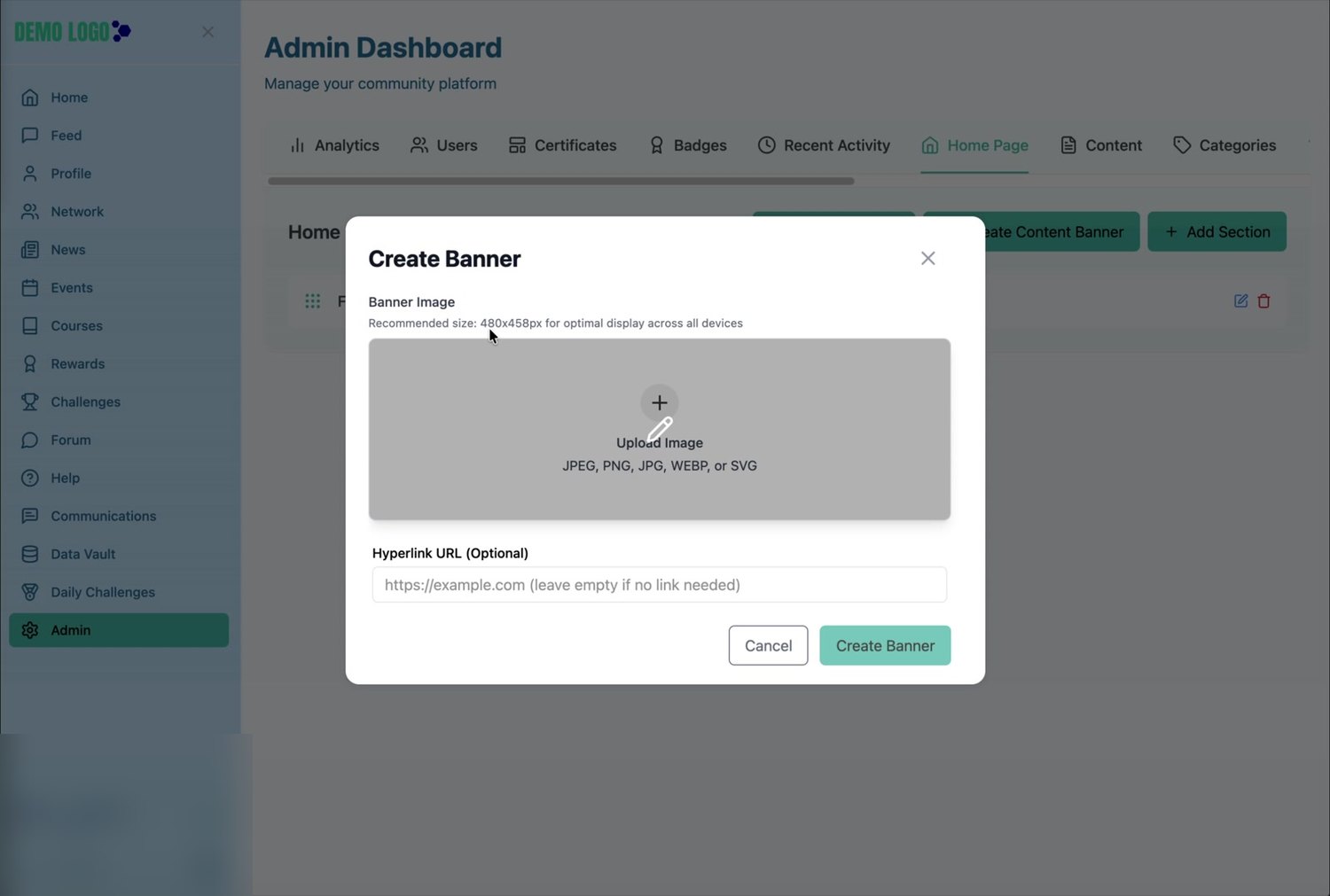
Select Create Banner
Use this option for the wide banner displayed across the top of the home-page content.
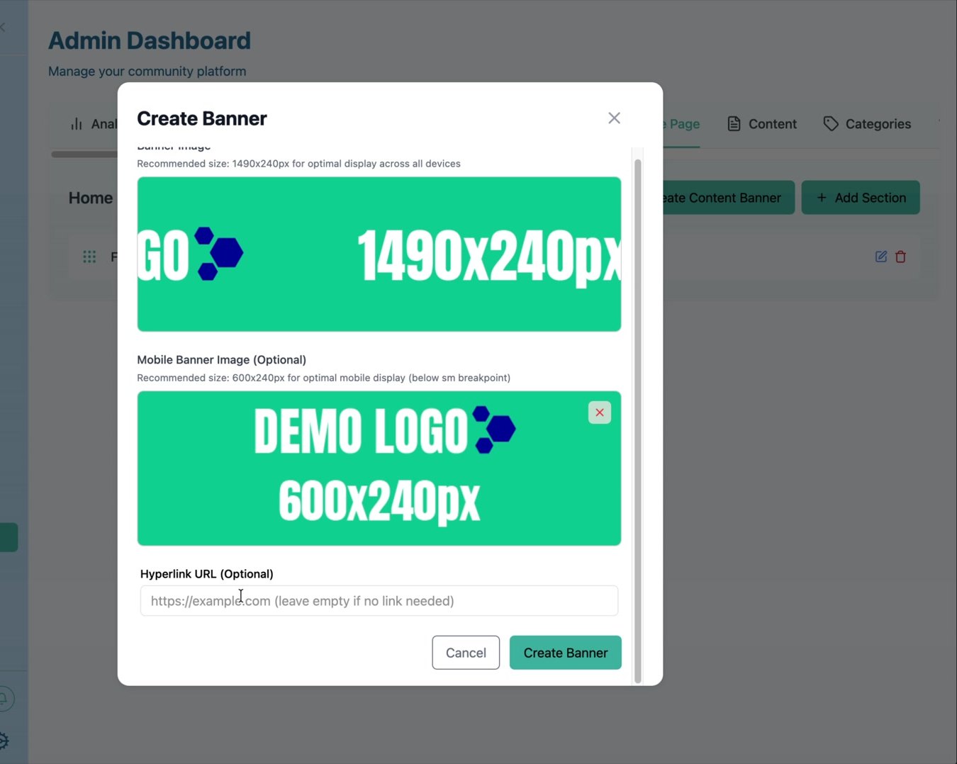
Upload the desktop artwork
Use the recommended 1490 × 240 px banner image.
Add a mobile banner when needed
The optional mobile image uses the recommended 600 × 240 px size and is displayed below the small-screen breakpoint.
Add an optional hyperlink
Leave the field empty when the banner is purely visual, or enter the approved destination when the complete banner should be clickable.
Select Create Banner
Save, return to the member Home page and test both desktop and mobile artwork.
Create a content banner
Select Create Content Banner to add a visual tile alongside the other home-page sections. The walkthrough shows a recommended size of 480 × 458 px and an optional hyperlink URL.
Review and quality-check the home page
- The desktop banner uses the 1490 × 240 px artwork.
- The mobile banner has been supplied where a separate crop is needed.
- Section titles and descriptions fit without awkward truncation.
- Every button and clickable banner opens the intended destination.
- Cards appear in the intended order.
- Images remain readable on desktop and narrow screens.
- No temporary demo copy or placeholder artwork remains.
- The client or content owner has approved the final member view.
Common issues
An image is cropped poorly
Re-export the artwork at the recommended size and keep essential text and logos away from the outer edges.
A button opens the wrong page
Recheck the link type and destination URL. For internal destinations, copy the correct portal route rather than typing it from memory.
The mobile banner looks like the desktop version
Confirm that a separate mobile image was uploaded and test below the small-screen breakpoint.
A new item does not appear immediately
Confirm the creation action completed, then refresh the member Home page. If the issue remains, reopen Home Page Layout and verify the item is listed.
Hub version 0.3.7 · Last updated 16 July 2026